Album Artwork [Iterations and Final Draft]

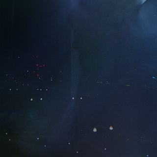
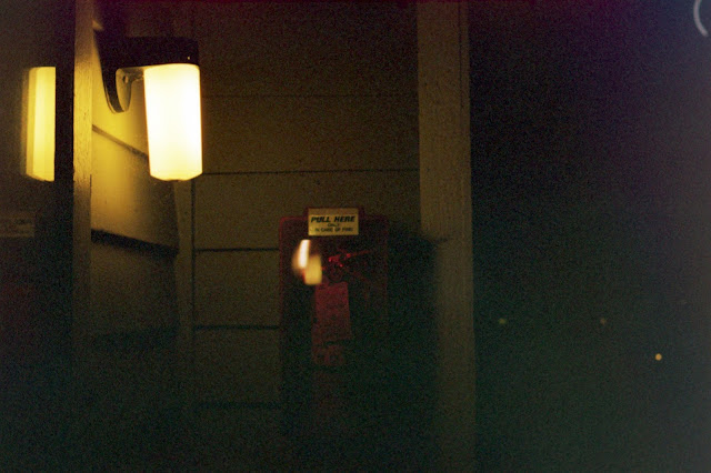
below are a series of iterations that this album artwork went through; although none of the changes may seem too radical; trying to balance the light sources across the different blending layers proved to be a difficult process, although it was very rewarding to experiment with it. I created a streak of light and played with layering it over the first image I had come up with, and it ended up being very interesting, although potentially overpowering. However, that seemed to work with my concept, as I feel that the way light is generated and perceived is very reflective of human activity. the final image was not notably different from the earlier drafts, but I found that in this case subtlety was more effective, and that I didn't want to stray too far from the original composition I had created. I also adopted the aspect ratio from the original square composition of an album art to something with a little more interest.


